Rehabilitation Banner Design & Production Slug
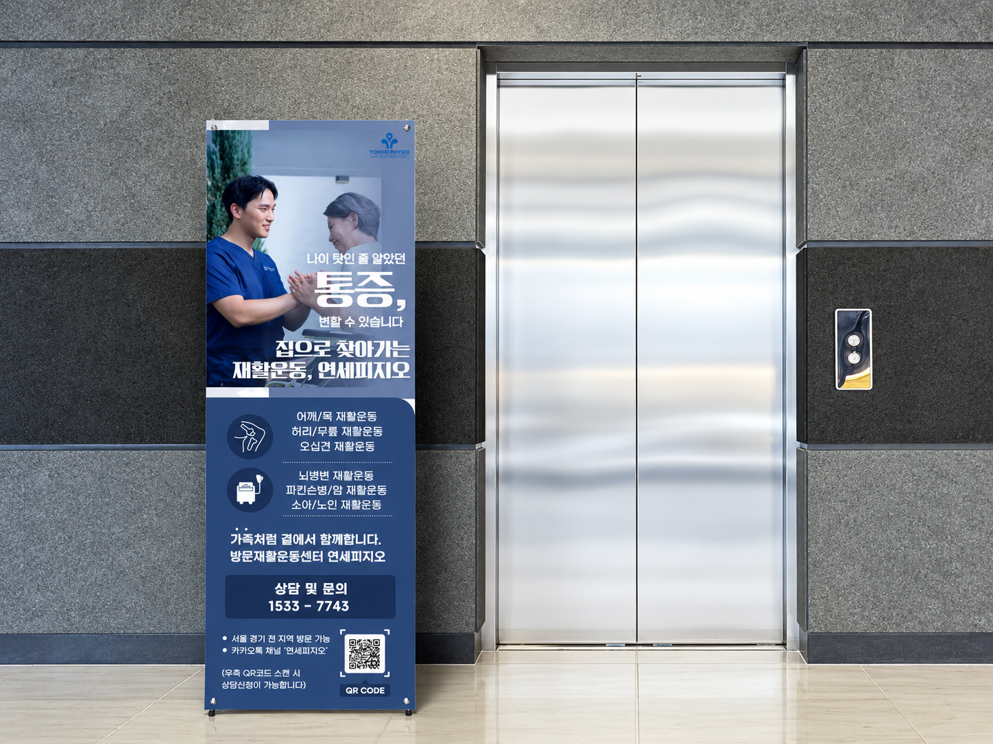
A rehabilitation banner designed to capture attention in passing through a strong visual layout and warm, approachable messaging. It clearly communicates home-visit rehabilitation services while creating a friendly and reassuring impression.
Challenge
Strategy
Execution
Results
A Rehabilitation Banner Designed to Catch Attention in Passing
Offline banners need to do more than display information.
They must attract attention quickly and communicate the service clearly in a short moment.
This rehabilitation banner was designed and produced to stand out at a glance while helping viewers immediately understand the service being offered.
Built to Draw Attention First
The design begins with visibility.
A strong main visual and bold headline were placed at the top so the banner would naturally catch the eye, even from a distance. Rather than filling the layout with too much information, the structure was designed to guide attention first and then encourage reading.
The image and copy were arranged to work together as a unified visual flow.
Warm Messaging for a More Approachable Impression
Rehabilitation services are not only about treatment, but also about reassurance and trust.
For that reason, the copy was written in a warmer and more approachable tone rather than using only formal medical language. The goal was to help viewers and family members feel that the service is caring and accessible, while still maintaining a professional image.
Clear Information That Can Be Read Quickly
Visual impact alone is not enough if the service itself is unclear.
Below the main copy, the banner organizes key rehabilitation categories in an easy-to-read way, including shoulder and neck rehabilitation, back and knee rehabilitation, frozen shoulder rehabilitation, brain lesion rehabilitation, Parkinson’s disease and cancer rehabilitation, and pediatric and senior rehabilitation.
The lower section includes a consultation number and QR code so that interested viewers can move directly to inquiry and contact.
An Offline Promotional Piece That Combines Attention and Clarity
This project was designed not only to look appealing, but also to function effectively as an offline promotional banner.
It combines:
- a layout that catches attention in passing,
- warm and approachable wording,
- clear presentation of service details,
- and practical contact guidance.
Through this banner, MEDISEE.NET aimed to express both the professionalism of rehabilitation care and the approachable nature of home-visit support in one cohesive design.