Hospital Tarpaulin Tote Bag Design & Production
Designed to be chosen for its look, not just received as a giveaway, this tarpaulin tote brings Seoul Baekgang Hospital’s brand into everyday life. Bold color blocking and logo-inspired patterns create a contemporary design, with coordinated details across the panels and handles. A spacious interior and two handle lengths add everyday practicality.
Challenge
Strategy
Execution
Results
Hospital Merchandise Worth Carrying for Its Design
“Could a hospital giveaway become a bag people would choose to carry in everyday life?”
This question shaped the Seoul Baekgang Hospital tarpaulin tote project.
The goal went beyond printing a hospital name and contact details on a bag. We wanted to create something visually appealing in its own right—a tote designed to feel at home on shopping trips and everyday outings.
Expressing the Brand Through Color and Graphics
Rather than starting with how much information to include, we considered how the finished bag should look and feel.
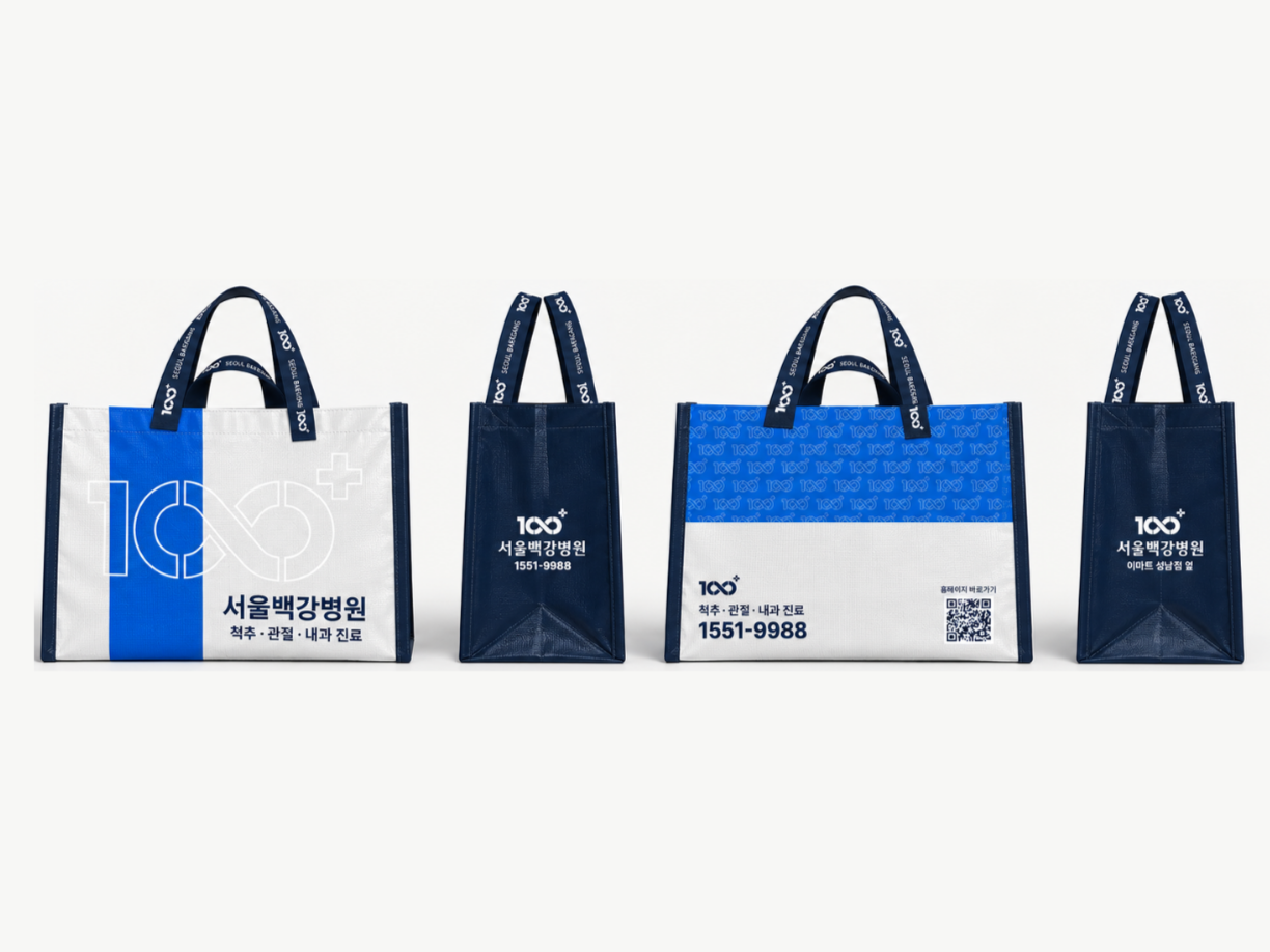
A blue, navy and silver-white palette creates a bold visual contrast. The hospital symbol appears both as an oversized outline and as a repeating pattern, becoming part of the bag’s graphic composition rather than simply a logo placed on its surface.
The design preserves the hospital’s identity while allowing color and graphics to lead the visual impression.
A Considered Design from Every Angle
The front combines a vertical blue accent with an oversized outline symbol for a clean, striking composition.
The back offers a different look, pairing a blue patterned upper section with a silver-white area below. Hospital information and a QR code sit within the lower section, keeping essential details accessible without overwhelming the design.
Navy side panels balance the brighter surfaces. Repeating logos and the hospital’s English name extend the identity to the handles, creating a coordinated design down to the smaller details.
Designed to Look Good and Work Well
Everyday usability was considered alongside appearance.
Two short handles and two long shoulder straps allow both hand-carry and shoulder-carry use.
Visual appeal and practical convenience were equally important to the finished product.
A Hospital Brand, Carried Through Everyday Design
The project covered design planning, panel graphics, handle design, information layout, production specifications and bag production.
The aim was not simply to create a bag with a hospital name on it, but to create an appealing everyday tote that also carries the hospital’s identity.
The finished Seoul Baekgang Hospital tote brings that idea into a tangible, practical product.