Rehabilitation Exercise Banner Design & Production
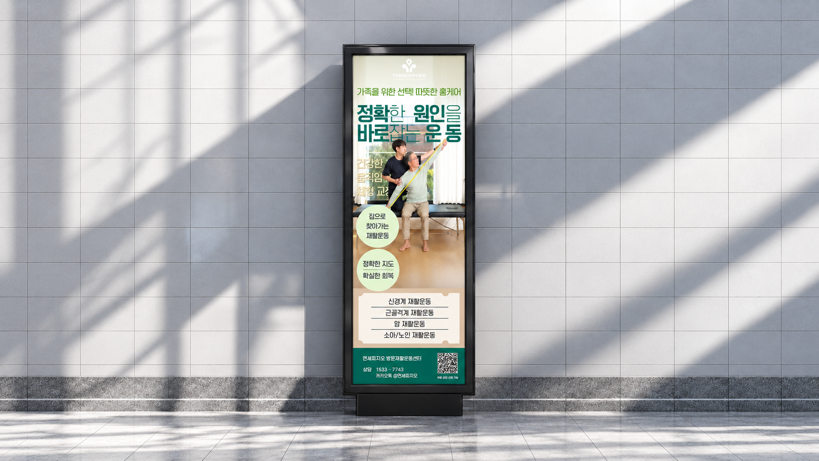
A rehabilitation exercise banner designed to catch attention at a glance through a balanced mix of imagery and copy. Warm tones create an approachable mood while clearly communicating the center’s services and professionalism.
Challenge
Strategy
Execution
Results
A Rehabilitation Banner Designed to Catch Attention at a Glance
For offline banners, visual impact matters just as much as information.
This rehabilitation exercise banner was designed and produced to attract attention quickly while helping passersby understand the service in a short moment.
A Balanced Mix of Imagery and Copy
One of the main design goals was balancing visuals and text.
Rehabilitation services often require explanation, but too much text can reduce readability in a walk-by environment. On the other hand, relying only on imagery can weaken the message.
This banner uses a rehabilitation scene as the main visual and supports it with clearly structured copy so that the image and message work together.
A Warm Tone for an Approachable Mood
Rehabilitation should communicate both professionalism and care.
The banner was designed with a warm-toned palette to create a softer, more reassuring impression rather than a cold or overly clinical one.
This warmer visual atmosphere helps reduce psychological distance and makes the service feel more approachable to both patients and family members.
Clear Messaging for Fast Recognition
Because banners are usually seen in passing, hierarchy and readability were key.
The main headline was designed to stand out even from a distance, while supporting messages and service details were arranged below in a natural reading flow.
Key points such as home-based rehabilitation, accurate guidance and recovery support were organized into short, easy-to-grasp statements.
Combining Atmosphere with Practical Information
The lower section includes practical contact elements such as the center name, consultation number and QR code, making the banner functional as well as visually engaging.
This project was not only about creating a visually appealing design, but also about producing an offline promotional piece that communicates service value clearly and effectively.