Hospital Wet Wipes Package Design & Production
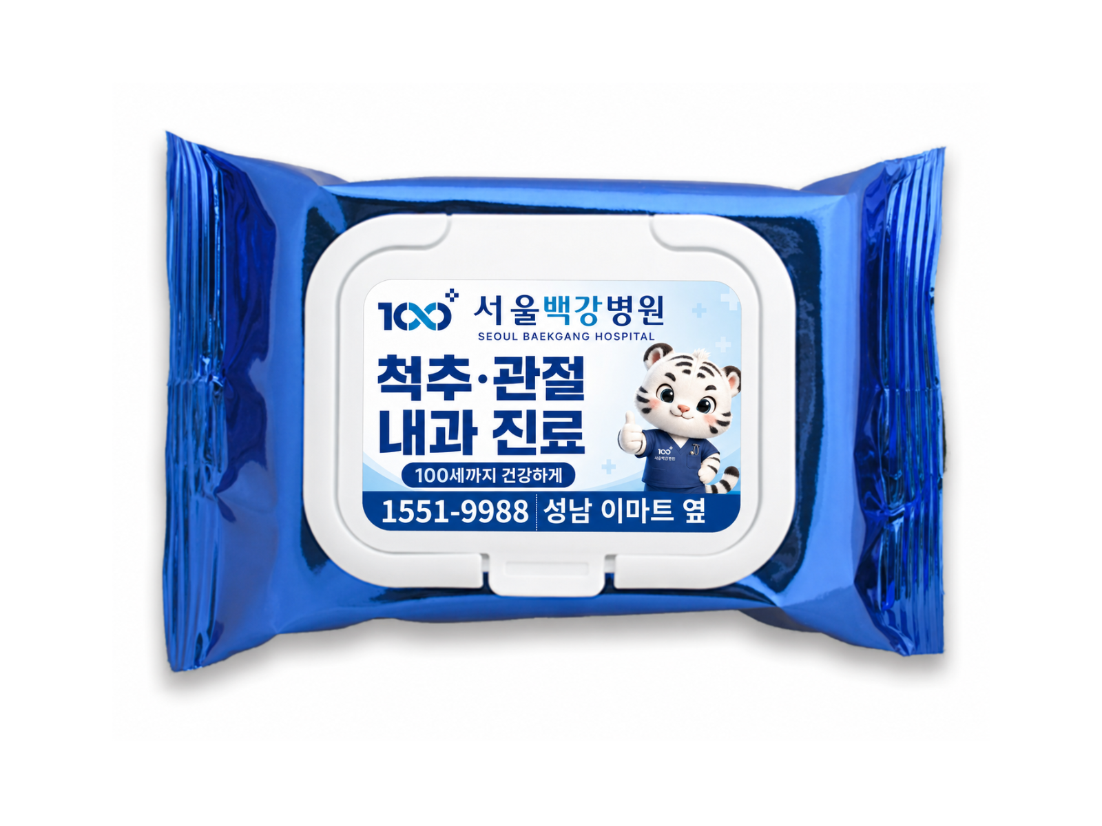
A cap-type wet wipes package designed for Seoul Baekgang Hospital using its signature blue palette and mascot. The layout highlights key hospital information while adding a friendly, memorable touch through the character design.
Challenge
Strategy
Execution
Results
A Practical Promotional Item Designed to Feel Worth Keeping
Wet wipes are one of the most practical hospital promotional items.
They are used in everyday situations, making them a natural way to keep a hospital’s name visible.
For this Seoul Baekgang Hospital project, the goal went beyond simply printing information on the package.
The intention was to design a cap-type wet wipes product that people would actually want to carry.
A Blue Palette That Reflects the Hospital’s Identity
The overall package was built around the hospital’s signature blue color.
From the outer package to the front label, the blue-toned composition creates an immediate connection to the hospital’s visual identity.
The clean, vivid palette was also chosen to align with a professional and trustworthy medical image.
Clear Visibility for Essential Hospital Information
With a compact package, information hierarchy becomes especially important.
The front label organizes the hospital logo, name, service-related wording, main phone number and location so they can be understood at a glance.
Rather than filling the limited space with too much text, the design focuses on the key details people are most likely to remember and use.
A Friendly Accent Through the Hospital Mascot
The most distinctive element of the design is the use of the hospital mascot.
Medical promotional items can often feel formal or information-heavy. By adding the mascot as a key visual element, the package becomes more approachable and memorable.
The mascot is not used as decoration alone, but as a visual focal point that helps draw attention and reinforce brand recall while softening the overall impression.
From Giveaway to Branded Good
This project aimed to combine practicality, visibility and emotional appeal in a single promotional item.
The signature blue palette strengthens the hospital’s identity, the essential information remains clear and prominent, and the mascot adds a cute, eye-catching point that makes the item feel more like a branded good than a typical giveaway.