Hospital Shopping Bag Design & Production
MEDISEE.NET designed and produced branded shopping bags for Seoul Baekgang Hospital. Flowing blue wave graphics complement the hospital’s logo, conveying a sense of precision and understated sophistication. Layered lines and generous white space add movement and depth, while essential details—including the hospital’s location, services and main phone number—remain clearly organized.
Challenge
Strategy
Execution
Results
Clear Information, a Contemporary and Refined Hospital Image
A hospital shopping bag serves a practical purpose while carrying the hospital’s name and essential information. For this project, we wanted the design to communicate more than those details alone.
The Seoul Baekgang Hospital shopping bag was developed to balance clear information with a visual impression of precision, modernity and understated sophistication.
Bringing Movement to a Static Layout
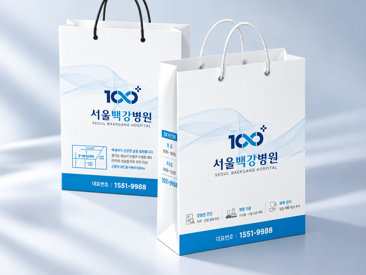
The defining element is a flowing blue wave graphic designed to complement the hospital’s logo.
Rather than using a solid color block or a decorative pattern, we created a composition of fine, overlapping lines. Their layered structure adds a sense of precision and depth, while the curves introduce gentle movement.
The intention was to move beyond a static arrangement of logos and text, suggesting a contemporary, forward-looking medical identity through the graphic design.
Complementing the Logo Without Competing with It
The wave graphic was designed to work with the logo rather than become a separate focal point.
Soft blue curves flow around the more vivid hospital logo, supported by generous white space. This keeps the hospital’s name clearly visible while adding depth and continuity to the composition.
Instead of relying on heavy decoration, the design expresses sophistication through fine lines, subtle color variations and a considered balance between graphics and open space.
Keeping Essential Information Easy to Find
Readability was considered alongside visual appeal.
The hospital’s location, service information and main phone number were included without crowding every detail onto a single surface. Each panel was given a distinct role.
The front focuses on the logo and wave graphic, with concise service-related messages and icons below. The back organizes location information and a map, while the side panel presents consultation hours.
The main phone number is highlighted within the blue band at the bottom. This creates a clear information area that balances the softer, flowing graphics above.
A Considered Balance, from Concept to Production
The project was not simply about adding a blue wave to a shopping bag. It was about considering what that graphic would communicate about the hospital.
The final composition balances the logo’s visibility, the readability of essential details and a contemporary, refined visual impression.
MEDISEE.NET handled design planning, wave graphics, information layout, final artwork and production.
The result is a practical branded shopping bag designed to carry the hospital’s identity through its overall composition and smallest visual details.