Hospital E-Mart In-Store Advertising
MEDISEE.NET developed shopping cart and in-store display ads for Seoul Baekgang Hospital at E-Mart. Following a site visit and a review of existing hospital ads, we created a mascot-led concept tailored to the shopping experience. Rather than simply listing hospital services, the campaign connected everyday shopping with a reminder to check on one’s health through contextual copy and distinctive visuals.
Challenge
Strategy
Execution
Results
A Reminder to Think About Health While Shopping
People visit E-Mart to buy groceries and everyday essentials—not primarily to look for a hospital.
That distinction shaped Seoul Baekgang Hospital’s shopping cart and in-store display campaign. Rather than starting with a list of hospital services, we considered what would feel relevant to people in the middle of a shopping trip.
The resulting concept connected an everyday activity with a gentle reminder to check on one’s health.
Visiting the Store Before Designing the Ads
MEDISEE.NET visited the advertising location to review the environment and the hospital ads already displayed there.
We considered not only what the hospital wanted to communicate, but also how its message could stand apart within that setting. This review informed a mascot-led creative direction built around the hospital’s own visual identity.
The mascot’s expressions and gestures were used to attract attention first, with essential hospital information integrated into the composition.
Copy Written for the Shopping Experience
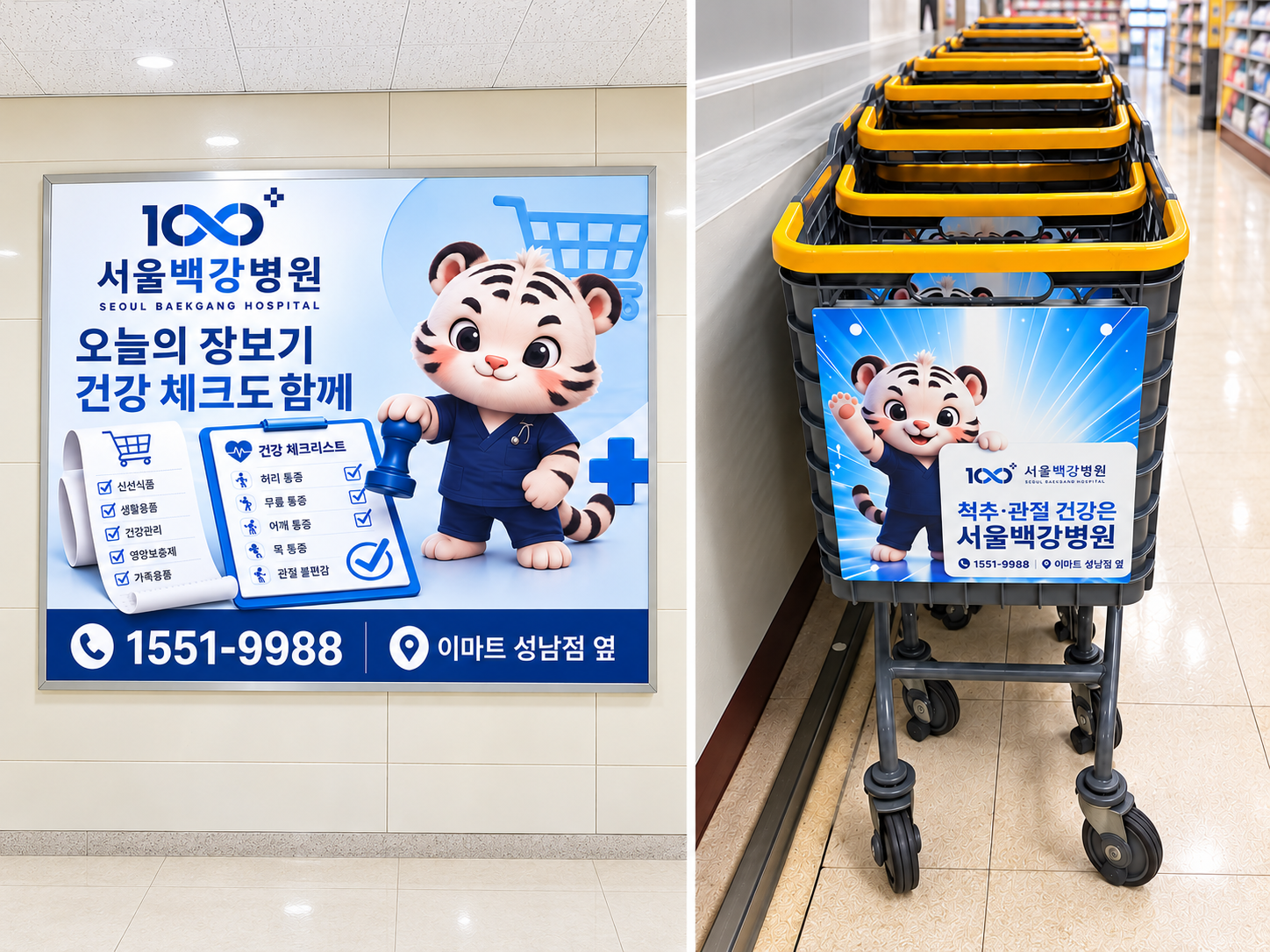
The main display headline translates as:
Today’s shopping—with a health check, too.
Instead of delivering a generic hospital promotion, the copy referred directly to what shoppers were doing at that moment.
The visuals reinforced the same idea. A shopping list, a health checklist and shopping cart imagery appeared alongside the hospital mascot, connecting the message to its surroundings.
The aim was to create an ad that belonged in E-Mart, rather than a hospital ad that simply happened to be displayed there.
Different Formats, Different Compositions
The in-store display used the mascot and checklist illustrations to develop the shopping-and-health concept. The headline, main graphics and contact information each had a clear place within the layout.
The shopping cart ad used a shorter message:
Spine and joint health—Seoul Baekgang Hospital.
A waving mascot accompanied the hospital name and key service areas. Rather than shrinking the display artwork, we adjusted the copy and information density for the cart format.
Both designs shared the same mascot and blue brand palette, maintaining a consistent hospital identity across the two placements.
Distinctive Visuals, Location-Based Information
The mascot was used as a central communication element, not simply as decoration. Its friendly expression and gestures were intended to make the health message approachable while giving the ads a recognizable visual character.
Contact details and the phrase “Next to E-Mart Seongnam” provided practical information using the shoppers’ current location as a reference point.
The design balanced visual appeal with clear hospital identification and location guidance.
Hospital Advertising Built Around Its Setting
The project covered a site visit, a review of existing hospital ads, creative strategy, copywriting, format-specific design and campaign placement.
Rather than considering only where to display the hospital’s information, we began with why people were visiting that place.
The campaign brought together the shopping context and the hospital’s message through a coordinated, location-specific advertising concept.